
15 Tips To Make Website Responsive
Enhance user experience with our 15 expert tips for responsive web design. Optimize your website for all devices effortlessly. Boost engagement now!
12/26/20233 min read

Introduction
In today's digital age, having a responsive website is no longer a luxury but a necessity. With the increasing use of mobile devices, it is crucial for businesses to ensure their websites adapt seamlessly to different screen sizes and resolutions. A responsive website not only enhances the user experience but also plays a vital role in improving search engine rankings. In this blog post, we will explore what a responsive website is, why it is essential, and provide you with ten valuable tips to make your website responsive.
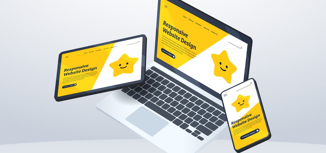
What is a Responsive Website?
A responsive website is designed to automatically adjust its layout, content, and images to provide an optimal viewing experience across various devices, including desktops, laptops, tablets, and smartphones. It eliminates the need for users to zoom in or scroll horizontally, ensuring that the website is easily accessible and visually appealing on any screen size.
Why is Making a Website Responsive a Necessity?
1. Enhanced User Experience: A responsive website ensures that visitors can navigate and interact with your content effortlessly, regardless of the device they are using. This seamless experience leads to increased engagement, longer visit durations, and higher conversion rates.
2. Mobile Usage Dominance: With mobile devices accounting for a significant portion of internet traffic, having a responsive website is crucial to reach and engage with your target audience effectively. Failure to provide a mobile-friendly experience may result in high bounce rates and missed business opportunities.
3. SEO Benefits: Search engines, like Google, prioritize responsive websites in their search results. A mobile-friendly website is a key ranking factor, and having a responsive design can significantly improve your website's visibility and organic traffic.
15 Tips to Make a Website Responsive:
1. Start with a Mobile-First Approach: To ensure your website looks great on all devices, design and build it with a mobile-first approach. Begin by creating a mobile-friendly layout, and then gradually add more design elements for larger screens.
3. Optimize Images: Images play a vital role in website design, but they can also slow down your site. Optimize your images by resizing and compressing them without compromising quality. This helps reduce loading times and keeps your website responsive.
2. Use a Responsive Framework: Leverage a responsive framework like Bootstrap or Foundation to simplify the process of making your website responsive. These frameworks provide a solid foundation and offer pre-built responsive components that can be easily customized.
4. Implement Media Queries: Media queries are CSS techniques that allow you to apply different styles based on the device's screen size. Make use of media queries to define breakpoints and adjust your website's layout accordingly.
5. Prioritize Content: Ensure that your website's content is displayed in a logical order, with the most important elements taking precedence. This allows users to access key information effortlessly, regardless of the device they're using.
6. Use Flexible Grids and Layouts: Design your website using flexible grids and layouts that can adapt to different screen sizes. Utilizing percentage-based widths instead of fixed pixel widths helps elements resize fluidly.
7. Opt for Scalable Fonts: Choose fonts that scale well across various devices. Using relative font sizes, such as em or rem units, allows text to adjust proportionally based on the device's screen size.
8. Simplify Navigation: Keep your website's navigation simple and intuitive, especially on smaller screens. Consider using collapsible menus or hamburger icons to save space and improve the user experience.
9. Ensure Touch-Friendly Elements: As mobile users rely heavily on touch navigation, make sure your website's buttons, links, and interactive elements are large enough and easily accessible. This minimizes frustration and enhances user engagement.
10. Test on Multiple Devices and Browsers: Regularly test your website on a variety of devices, including smartphones, tablets, and desktops. Also, check how it performs on different browsers to identify and fix any responsiveness issues.
11. Optimize Loading Speed: A slow-loading website can be a major turn-off for users. Optimize your website's loading speed by minimizing HTTP requests, reducing server response time, and caching static resources.
12. Consider Accelerated Mobile Pages (AMP): Implementing AMP can significantly improve the loading speed of your web pages, especially on mobile devices. AMP strips down unnecessary elements, resulting in a faster and more responsive website.
13. Provide Clear Call-to-Actions (CTAs): Ensure that your website's CTAs stand out and are easy to locate. Use contrasting colours and well-defined shapes to guide users towards taking desired actions, regardless of the device they're using.
14. Opt for Responsive Forms: Make sure your website's forms are easy to use and fill out on any device. Use input fields that adjust to the screen size and consider implementing features like autofill to enhance user convenience.
15. Regularly Update and Maintain: Websites are not a one-and-done project. Regularly update and maintain your website to ensure continued responsiveness. Keep an eye out for new trends, technologies, and user feedback to make necessary adjustments.
Conclusion
Achieving a responsive website is a continuous process that requires attention to detail and an understanding of user behaviour across different devices. By implementing these 15 tips, you can significantly enhance your website's responsiveness and provide an outstanding user experience.