
Why Responsive Website Matters for Businesses
12/26/20233 min read
Introduction
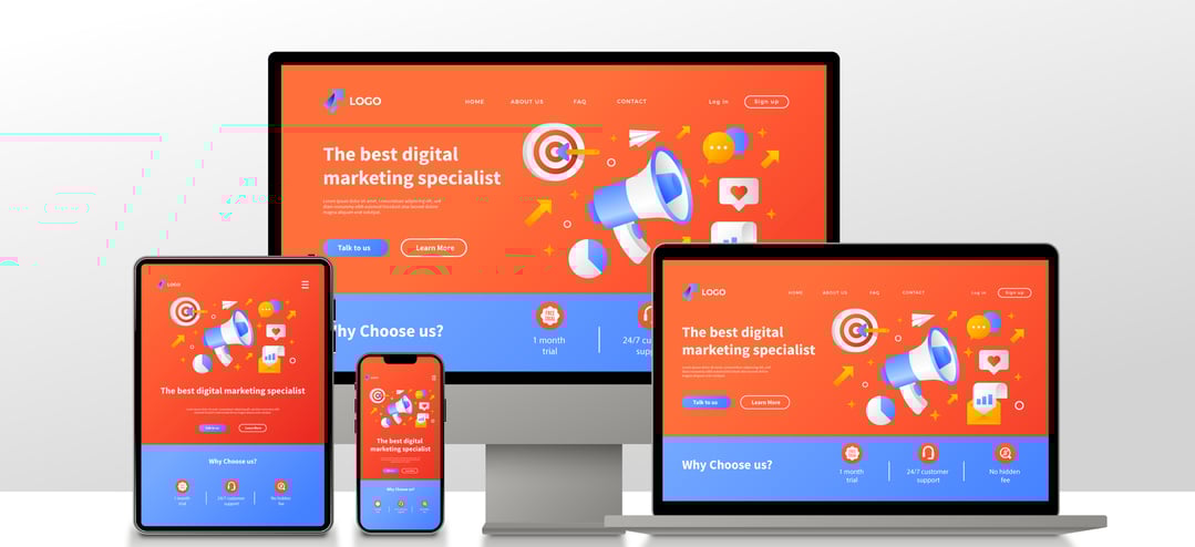
In today's digital environment, having an adaptable website is essential to a business's success online. A website is said to be "responsive" if it can adjust and show properly across a range of screen sizes and devices, such as desktops, laptops, tablets, and smartphones.Increasingly individuals are using mobile devices to access the internet as smartphones and tablets become increasingly commonplace.
Why a Responsive Website Matters for Businesses
1. Enhanced User Experience: A responsive website provides a seamless and consistent experience to users across different devices. By automatically adjusting its layout, font sizes, and image dimensions, it ensures that your content remains easily readable and visually appealing, regardless of the screen size. This enhances user satisfaction and encourages them to stay longer on your site, ultimately increasing the chances of conversions.
2. Improved SEO Performance: Search engines like Google prioritize responsive websites in their search results. With the increasing number of mobile searches, having a responsive site is crucial to rank higher in search engine results pages (SERPs). Additionally, with a single website to manage, you can focus your efforts on optimizing one URL instead of multiple versions for different devices.
3.Increased Reach: A responsive website allows you to reach a wider audience, as it caters to the growing number of mobile users. With more people accessing the internet through their smartphones, tablets, and other mobile devices, it's important to provide a seamless browsing experience across all platforms.
1. Mobile-First Approach: Design with mobile users in mind and then scale up for larger screens. This approach ensures that your site is optimized for mobile devices and offers a solid foundation for scalability.
4.Readable Typography: Choose fonts and font sizes that are easily readable on all devices. Avoid tiny fonts that require zooming in, as it can frustrate users and lead to higher bounce rates.
3. Intuitive Navigation: Simplify navigation menus for smaller screens, making it easier for users to find what they're looking for. Consider utilizing hamburger menus or collapsing navigation elements to save space.
2. Optimize Images: Compress and resize images to reduce loading times while maintaining visual quality. Large image files can significantly slow down your site, negatively impacting the user experience.
5.Test, Test, Test: Regularly test your website on various devices and browsers to ensure consistent functionality and visual appeal. Pay attention to load times, button sizes, and overall user experience.
Conclusion
A responsive website refers to a site that adapts to different devices and screen sizes, ensuring optimal functionality and visual appeal. Simply put, it is a website that looks great and works well whether you're browsing on a desktop, laptop, tablet, or smartphone. Why is this so important for businesses? Let's break it down.
4.Cost and Time Efficiency: Maintaining separate websites for different devices can be time-consuming and expensive. By investing in a responsive website, you eliminate the need for multiple versions, reducing both development and maintenance costs. It also streamlines content management, making updates and changes more efficient.
5.Future-Proofing Your Business: With technology constantly evolving, a responsive website ensures that your business stays ahead of the curve. As new devices and screen sizes emerge, your website will automatically adapt to meet the needs of your users. This future-proofing approach saves you from constantly redesigning your site to keep up with the latest trends.
Responsive Web Design Best Practices:
Responsive vs. Adaptive Web Design:
While both responsive and adaptive web design aim to provide an optimal user experience, they employ different approaches. Responsive design uses fluid grids, flexible images, and CSS media queries to adapt the layout based on the device's screen size. On the other hand, adaptive design uses predefined layouts tailored to specific devices or breakpoints. While both have their merits, responsive design is more commonly recommended due to its versatility and adaptability.
Responsive Web Design Frameworks:
Don't worry if you're not an expert in web programming! You can simplify the process with the help of a number of responsive web design frameworks. A few well-known frameworks are Bulma, Foundation, and Bootstrap. By offering pre-built responsive layouts and components, these frameworks let you easily develop a functional and polished website without having to start from scratch.
Having a flexible website is now a requirement for organizations in a world where the digital landscape is continuously changing. Through the implementation of best practices, responsive web design concepts, and frameworks, you can build an engaging online presence that works on all types of devices. Investing in a flexible website will improve user experience while fortifying your company against future changes in the ever changing digital landscape. Take the responsive approach now, and you'll see a huge increase in your internet exposure!